↓初回はこちら↓
前回の復習
前回はスマホ版開発の準備をしました。
メディアクエリをCSSに書くのと、HTMLにviewportの記述があるかの確認が必要でしたね。
今回はスマホ版のCSSを組んでいきます
今回はスマホ版のCSSを組んでいきましょう。
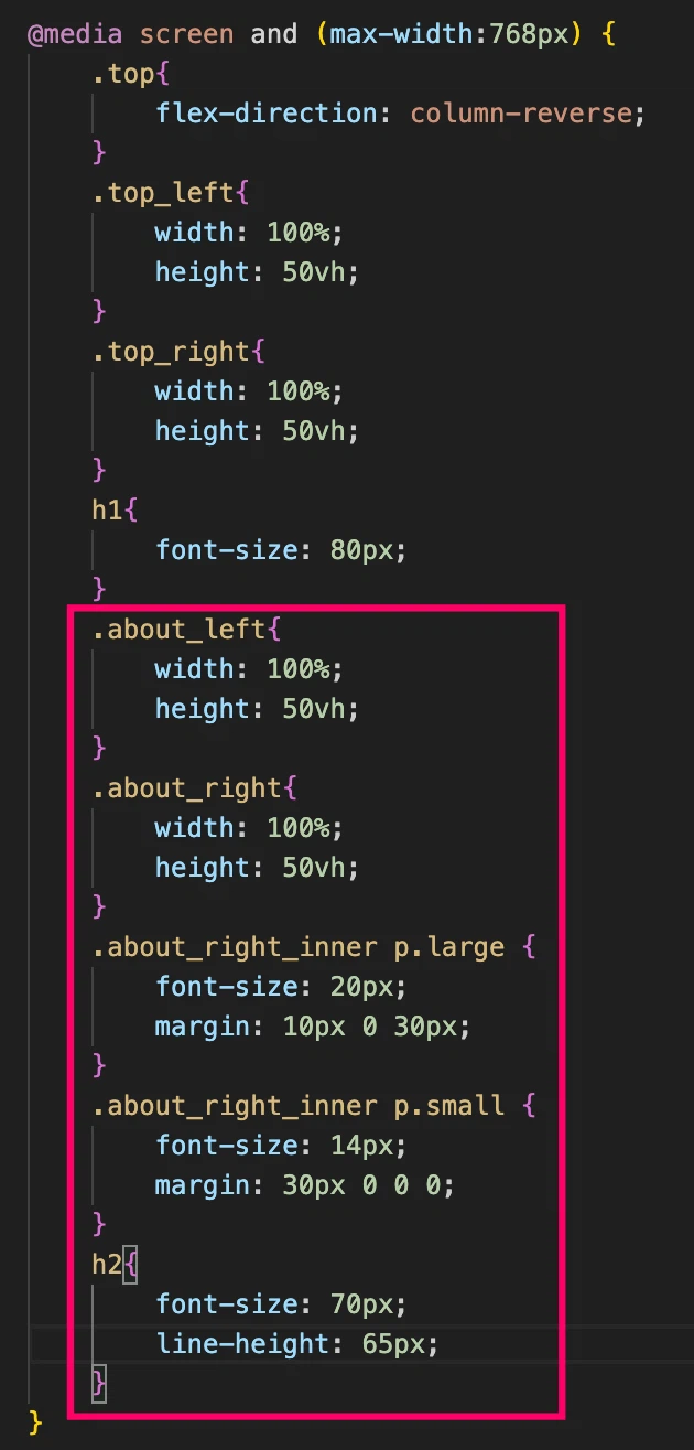
まずはトップページ。横並びになっている.top_leftと.top_rightをカラム落ちを使って縦並びにしていきます。
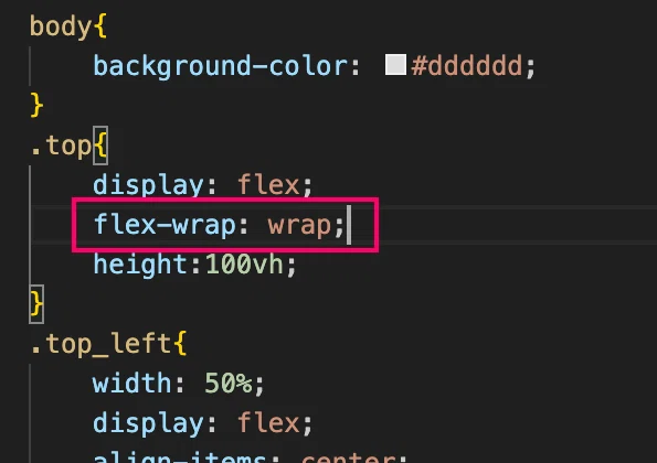
親要素に書いてカラム落ちを有効に
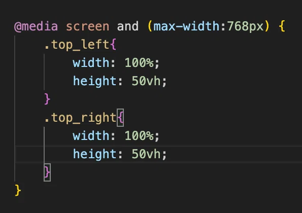
メディアクエリの中にスマホ用のCSSを記述
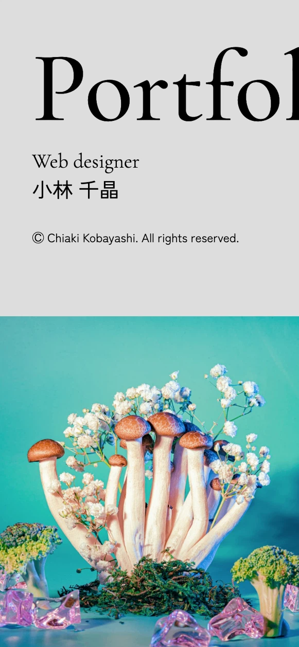
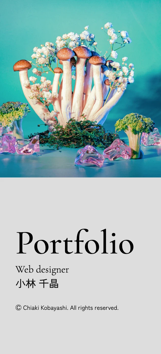
画像と文字列が50:50で縦並びになった
トップページを整えていきます
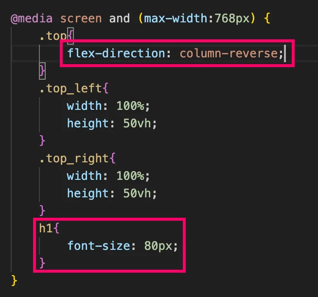
次にトップページを整えていきましょう。
flex-directionプロパティではflexでの並び順を指定することができます。
今回はflex-direction:column-reverseで横方向の並び順を逆方向にしています。
※ただカラム落ちがあるので、見た目上は縦並びの上下が入れ替わります。
文字サイズなども整えていく
上下の並びが入れ替わった
プロフィール部分を整えましょう
同様にプロフィール部分も縦並びにして整えていきます。
今回は画像と文章はそのままの並び順でOKなので、flex-directionの記述は不要です。
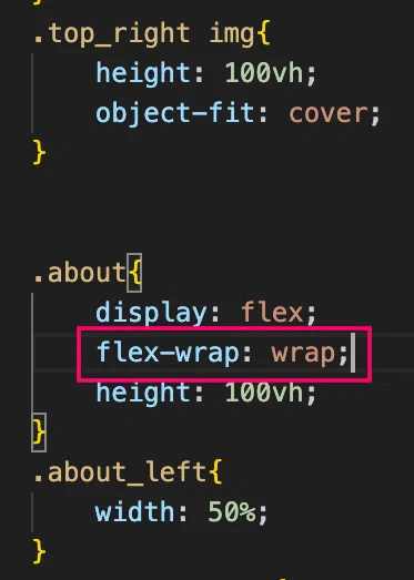
flex-wrapの記述を忘れずに
marginなども併せて修正していく
画像と文章が縦並びになった
これでプロフィール部分は完成です。
今回の復習
- 縦並びにするにはflex-wrap:wrap + width:100%でカラム落ち
- flex-direction:column-reverseで横方向の並び順を逆転
これらを頭に入れていただければOKです。
また今回の正確なコードが欲しい方は、記事の一番下に用意いたしましたので、参考にしてみてください。
いかがでしたか?
だんだんとできることが増えている実感はありませんか?
サイトを組むことに関してはかなり大詰めとなってきました!
これからも皆さんの夢の実現に向けて頑張っていきましょう!
↓次の回はこちら↓
↓正確なコードはこちら↓
index.html
<!DOCTYPE html>
<html lang="ja">
<head>
    <meta charset="UTF-8">
    <meta name="viewport" content="width=device-width, initial-scale=1.0">
    <title>Portfolio</title>
    <link rel="stylesheet" href="reset.css">
    <link rel="stylesheet" href="style.css">
    <link rel="preconnect" href="https://fonts.googleapis.com">
    <link rel="preconnect" href="https://fonts.gstatic.com" crossorigin>
    <link href="https://fonts.googleapis.com/css2?family=Cormorant+Garamond:ital,wght@0,300;0,400;0,500;0,600;0,700;1,300;1,400;1,500;1,600;1,700&family=Zen+Kaku+Gothic+New&display=swap" rel="stylesheet">
</head>
<body>
    <div class="top">
        <div class="top_left">
            <div class="top_left_inner">
                <h1 class="cormorant-garamond-medium">Portfolio</h1>
                <p class="cormorant-garamond-light">Web designer</p>
                <p class="zen-kaku_gothic_new-regular">小林 千晶</p>
                <p class="small zen-kaku_gothic_new-regular">Ⓒ Chiaki Kobayashi. All rights reserved.</p>
            </div>
        </div>
        <div class="top_right">
            <img src="images/top.jpg" alt="トップ画像">
        </div>
    </div>
    <div class="about">
        <div class="about_left">
            <img src="images/profile.jpg">
        </div>
        <div class="about_right">
            <div class="about_right_inner">
                <h2 class="cormorant-garamond-medium">Chiaki<br>Kobayashi</h2>
                <p class="cormorant-garamond-medium large">Web designer since 2024</p>
                <p class="zen-kaku_gothic_new-regular">1994年北海道生まれ、東京都在住<br>
                    芸術大学デッサン学科卒業後、アシスタントを経て<br>
                    フリーランスのWebデザイナーに。<br>
                    <br>
                    雑誌、企業サイト、広告などで活動中</p>
                <p class="small zen-kaku_gothic_new-regular">©  Chiaki Kobayashi. All rights reserved.</p>
            </div>
        </div>
    </div>
    <div class="portfolio">
        <div class="portfolio_title cormorant-garamond-medium large">
            <h2>Portfolio</h2>
        </div>
        <div class="portfolio_works">
            <div class="portfolio_image"><a href="#"><img src="images/portfolio01.jpg"></a></div>
            <div class="portfolio_image"><a href="#"><img src="images/portfolio02.jpg"></a></div>
            <div class="portfolio_image"><a href="#"><img src="images/portfolio03.jpg"></a></div>
            <div class="portfolio_image"><a href="#"><img src="images/portfolio04.jpg"></a></div>
            <div class="portfolio_image"><a href="#"><img src="images/portfolio05.jpg"></a></div>
            <div class="portfolio_image"><a href="#"><img src="images/portfolio06.jpg"></a></div>
        </div>
    </div>
    <div class="footer">
        <h2 class="cormorant-garamond-medium large">Contact</h2>
        <p class="zen-kaku_gothic_new-regular">hello@subarashiisaito.jp</p>
        <p class="zen-kaku_gothic_new-regular">01-2345-6789</p>
        <p class="zen-kaku_gothic_new-regular">instagram @subarashiisaito</p>
        <p class="zen-kaku_gothic_new-regular">twitter @subarashiisaito</p>
        <p class="small zen-kaku_gothic_new-regular">©  Chiaki Kobayashi. All rights reserved.</p>
        <div class="footer_img">
            <img src="images/footer.jpg">
        </div>
    </div>
</body>
</html>
style.css
@charset "UTF-8";
.zen-kaku_gothic_new-regular {
    font-family: "Zen Kaku Gothic New", sans-serif;
    font-weight: 400;
    font-style: normal;
  }

.cormorant-garamond-light {
    font-family: "Cormorant Garamond", serif;
    font-weight: 300;
    font-style: normal;
}
.cormorant-garamond-regular {
    font-family: "Cormorant Garamond", serif;
    font-weight: 400;
    font-style: normal;
}
.cormorant-garamond-medium {
    font-family: "Cormorant Garamond", serif;
    font-weight: 500;
    font-style: normal;
}
.cormorant-garamond-semibold {
    font-family: "Cormorant Garamond", serif;
    font-weight: 600;
    font-style: normal;
}
.cormorant-garamond-bold {
    font-family: "Cormorant Garamond", serif;
    font-weight: 700;
    font-style: normal;
}
.cormorant-garamond-light-italic {
    font-family: "Cormorant Garamond", serif;
    font-weight: 300;
    font-style: italic;
}
.cormorant-garamond-regular-italic {
    font-family: "Cormorant Garamond", serif;
    font-weight: 400;
    font-style: italic;
}
.cormorant-garamond-medium-italic {
    font-family: "Cormorant Garamond", serif;
    font-weight: 500;
    font-style: italic;
}
.cormorant-garamond-semibold-italic {
    font-family: "Cormorant Garamond", serif;
    font-weight: 600;
    font-style: italic;
}
.cormorant-garamond-bold-italic {
    font-family: "Cormorant Garamond", serif;
    font-weight: 700;
    font-style: italic;
}
body{
    background-color: #dddddd;
}
.top{
    display: flex;
    flex-wrap: wrap;
    height:100vh;
}
.top_left{
    width: 50%;
    display: flex;
    align-items: center;
}
.top_right{
    width: 50%;
}
.top_left_inner{
    width: 80%;
    margin: 0 auto;
}
h1{
    font-size: 118px;
}
.top_left p{
    font-size: 24px;
}
.top_left p.small{
    font-size: 14px;
    margin: 30px 0 0 0;
}
.top_right img{
    height: 100vh;
    object-fit: cover;
}


.about{
    display: flex;
    flex-wrap: wrap;
    height: 100vh;
}
.about_left{
    width: 50%;
}
.about_left img{
    width: 100%;
    height: 100vh;
    object-fit: cover;
}
.about_right{
    width: 50%;
    display: flex;
    align-items: center;
}
h2{
    font-size: 85px;
    line-height: 85px;
}
.about_right_inner{
    width: 80%;
    margin: 0 auto;
}
.about_right_inner p{
    font-size: 16px;
}
.about_right_inner p.large{
    font-size: 20px;
    margin: 10px 0 90px;
}
.about_right_inner p.small{
    font-size: 14px;
    margin: 90px 0 0 0;
}
.portfolio{
    display: flex;
    width: 90%;
    margin: 120px auto 0;
}
.portfolio_title{
    width: 10%;
    display: flex;
    align-items: center;
}
.portfolio_title h2{
    -ms-writing-mode: tb-rl;
    writing-mode: vertical-rl;
}
.portfolio_works{
    width: 90%;
    display: flex;
    flex-wrap: wrap;
    row-gap: 2vw;
    column-gap: 2%;
}
.portfolio_image{
    width: 32%;
    font-size: 0;
    overflow: hidden;
}
.portfolio_image img{
    transition:0.5s all;
}
.portfolio_image img:hover{
    transform:scale(1.2,1.2);
    transition:0.5s all;
}

.footer{
    text-align: center;
    margin: 120px 0 0 0;
}
.footer h2{
    margin: 0 0 60px 0;
}
.footer p{
    font-size: 20px;
    line-height: 32px;
}
.footer p.small{
    margin: 60px 0 60px 0;
    font-size: 14px;
}
.footer .footer_img{
    font-size: 0;
}
.footer .footer_img img{
    object-fit: cover;
    width: 100%;
    height: 30vh;
}

@media screen and (max-width:768px) {
    .top{
        flex-direction: column-reverse;
    }
    .top_left{
        width: 100%;
        height: 50vh;
    }
    .top_right{
        width: 100%;
        height: 50vh;
    }
    h1{
        font-size: 80px;
    }
    .about_left{
        width: 100%;
        height: 50vh;
    }
    .about_right{
        width: 100%;
        height: 50vh;
    }
    .about_right_inner p.large {
        font-size: 20px;
        margin: 10px 0 30px;
    }
    .about_right_inner p.small {
        font-size: 14px;
        margin: 30px 0 0 0;
    }
    h2{
        font-size: 70px;
        line-height: 65px;
    }
}
reset.css
/***
    The new CSS reset - version 1.11.2 (last updated 15.11.2023)
    GitHub page: https://github.com/elad2412/the-new-css-reset
***/

/*
    Remove all the styles of the "User-Agent-Stylesheet", except for the 'display' property
    - The "symbol *" part is to solve Firefox SVG sprite bug
    - The "html" element is excluded, otherwise a bug in Chrome breaks the CSS hyphens property (https://github.com/elad2412/the-new-css-reset/issues/36)
 */
 *:where(:not(html, iframe, canvas, img, svg, video, audio):not(svg *, symbol *)) {
    all: unset;
    display: revert;
  }

  /* Preferred box-sizing value */
  *,
  *::before,
  *::after {
    box-sizing: border-box;
  }

  /* Fix mobile Safari increase font-size on landscape mode */
  html {
    -moz-text-size-adjust: none;
    -webkit-text-size-adjust: none;
    text-size-adjust: none;
  }

  /* Reapply the pointer cursor for anchor tags */
  a, button {
    cursor: revert;
  }

  /* Remove list styles (bullets/numbers) */
  ol, ul, menu, summary {
    list-style: none;
  }

  /* For images to not be able to exceed their container */
  img {
    max-inline-size: 100%;
    max-block-size: 100%;
  }

  /* removes spacing between cells in tables */
  table {
    border-collapse: collapse;
  }

  /* Safari - solving issue when using user-select:none on the <body> text input doesn't working */
  input, textarea {
    -webkit-user-select: auto;
  }

  /* revert the 'white-space' property for textarea elements on Safari */
  textarea {
    white-space: revert;
  }

  /* minimum style to allow to style meter element */
  meter {
    -webkit-appearance: revert;
    appearance: revert;
  }

  /* preformatted text - use only for this feature */
  :where(pre) {
    all: revert;
    box-sizing: border-box;
  }

  /* reset default text opacity of input placeholder */
  ::placeholder {
    color: unset;
  }

  /* fix the feature of 'hidden' attribute.
   display:revert; revert to element instead of attribute */
  :where([hidden]) {
    display: none;
  }

  /* revert for bug in Chromium browsers
   - fix for the content editable attribute will work properly.
   - webkit-user-select: auto; added for Safari in case of using user-select:none on wrapper element*/
  :where([contenteditable]:not([contenteditable="false"])) {
    -moz-user-modify: read-write;
    -webkit-user-modify: read-write;
    overflow-wrap: break-word;
    -webkit-line-break: after-white-space;
    -webkit-user-select: auto;
  }

  /* apply back the draggable feature - exist only in Chromium and Safari */
  :where([draggable="true"]) {
    -webkit-user-drag: element;
  }

  /* Revert Modal native behavior */
  :where(dialog:modal) {
    all: revert;
    box-sizing: border-box;
  }

  /* Remove details summary webkit styles */
  ::-webkit-details-marker {
    display: none;
  }/***
    The new CSS reset - version 1.11.2 (last updated 15.11.2023)
    GitHub page: https://github.com/elad2412/the-new-css-reset
***/

/*
    Remove all the styles of the "User-Agent-Stylesheet", except for the 'display' property
    - The "symbol *" part is to solve Firefox SVG sprite bug
    - The "html" element is excluded, otherwise a bug in Chrome breaks the CSS hyphens property (https://github.com/elad2412/the-new-css-reset/issues/36)
 */
 *:where(:not(html, iframe, canvas, img, svg, video, audio):not(svg *, symbol *)) {
    all: unset;
    display: revert;
  }

  /* Preferred box-sizing value */
  *,
  *::before,
  *::after {
    box-sizing: border-box;
  }

  /* Fix mobile Safari increase font-size on landscape mode */
  html {
    -moz-text-size-adjust: none;
    -webkit-text-size-adjust: none;
    text-size-adjust: none;
  }

  /* Reapply the pointer cursor for anchor tags */
  a, button {
    cursor: revert;
  }

  /* Remove list styles (bullets/numbers) */
  ol, ul, menu, summary {
    list-style: none;
  }

  /* For images to not be able to exceed their container */
  img {
    max-inline-size: 100%;
    max-block-size: 100%;
  }

  /* removes spacing between cells in tables */
  table {
    border-collapse: collapse;
  }

  /* Safari - solving issue when using user-select:none on the <body> text input doesn't working */
  input, textarea {
    -webkit-user-select: auto;
  }

  /* revert the 'white-space' property for textarea elements on Safari */
  textarea {
    white-space: revert;
  }

  /* minimum style to allow to style meter element */
  meter {
    -webkit-appearance: revert;
    appearance: revert;
  }

  /* preformatted text - use only for this feature */
  :where(pre) {
    all: revert;
    box-sizing: border-box;
  }

  /* reset default text opacity of input placeholder */
  ::placeholder {
    color: unset;
  }

  /* fix the feature of 'hidden' attribute.
   display:revert; revert to element instead of attribute */
  :where([hidden]) {
    display: none;
  }

  /* revert for bug in Chromium browsers
   - fix for the content editable attribute will work properly.
   - webkit-user-select: auto; added for Safari in case of using user-select:none on wrapper element*/
  :where([contenteditable]:not([contenteditable="false"])) {
    -moz-user-modify: read-write;
    -webkit-user-modify: read-write;
    overflow-wrap: break-word;
    -webkit-line-break: after-white-space;
    -webkit-user-select: auto;
  }

  /* apply back the draggable feature - exist only in Chromium and Safari */
  :where([draggable="true"]) {
    -webkit-user-drag: element;
  }

  /* Revert Modal native behavior */
  :where(dialog:modal) {
    all: revert;
    box-sizing: border-box;
  }

  /* Remove details summary webkit styles */
  ::-webkit-details-marker {
    display: none;
  }
コメント